Appreciates all types of design ideas. Good form & function should always work hand in hand but at times designs needs to be push through all types of boundaries. There is no standing still for design,only moving forward.
Tuesday, May 4, 2010
Korean Pavilion at Shanghai World Expo 2010
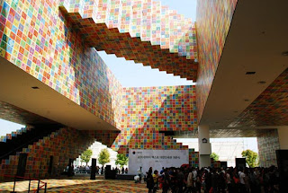
The Korean Pavilion at was designed by architectural firm Mass Studies. Using ‘convergence’ as the main theme, the korean pavilion is an amalgamation of ‘sign’ (symbol) and ‘space’: signs become spaces, and simultaneously, spaces become signs.
Sign As Space
Han-Geul, the Korean alphabet, is the prime element of ‘signs’ within the pavilion. The overall volume, lifted 7.2m above ground level, is created by converging these Han-Geul letters, allowing signs to create the exhibition space, and so that the visitors can experience their geometry through horizontal, vertical and diagonal movements. The primary geometries that compose the han-geul letters are universal to other cultures,
thus acting as a sort of ‘open’ set of signs that is engaging to everyone.
Most of the non-peripheral surfaces are composed of art pixels, which are 45cm x 45cm aluminum panels created by a Korean artist, Ik-Joong Kang, who is renowned for creating massive art walls out of small hand-painted tiles, either self-produced or by gathering from around the world (thus being another type of convergence).
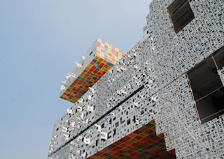
The exterior surfaces of the Korean pavilion are clad in 2 types of pixels: Han-Geul pixelsand art pixels. Han-Geul pixels are white panels with a relief of letters in four different sizeswhose combination forms the majority of the exterior, mainly the peripheral surfaces.
sequential lighting is installed behind the Han-Geul pixels to highlight the individual letters on the exterior facade at night,
further animating the pavilion as a sign (like a text message) on a larger scale.
For more info check here : shanghai expo 2010
All pics & info courtesy of designboom
You are who you decide to be ... Adapt & Overcome.
Subscribe to:
Post Comments (Atom)


No comments:
Post a Comment